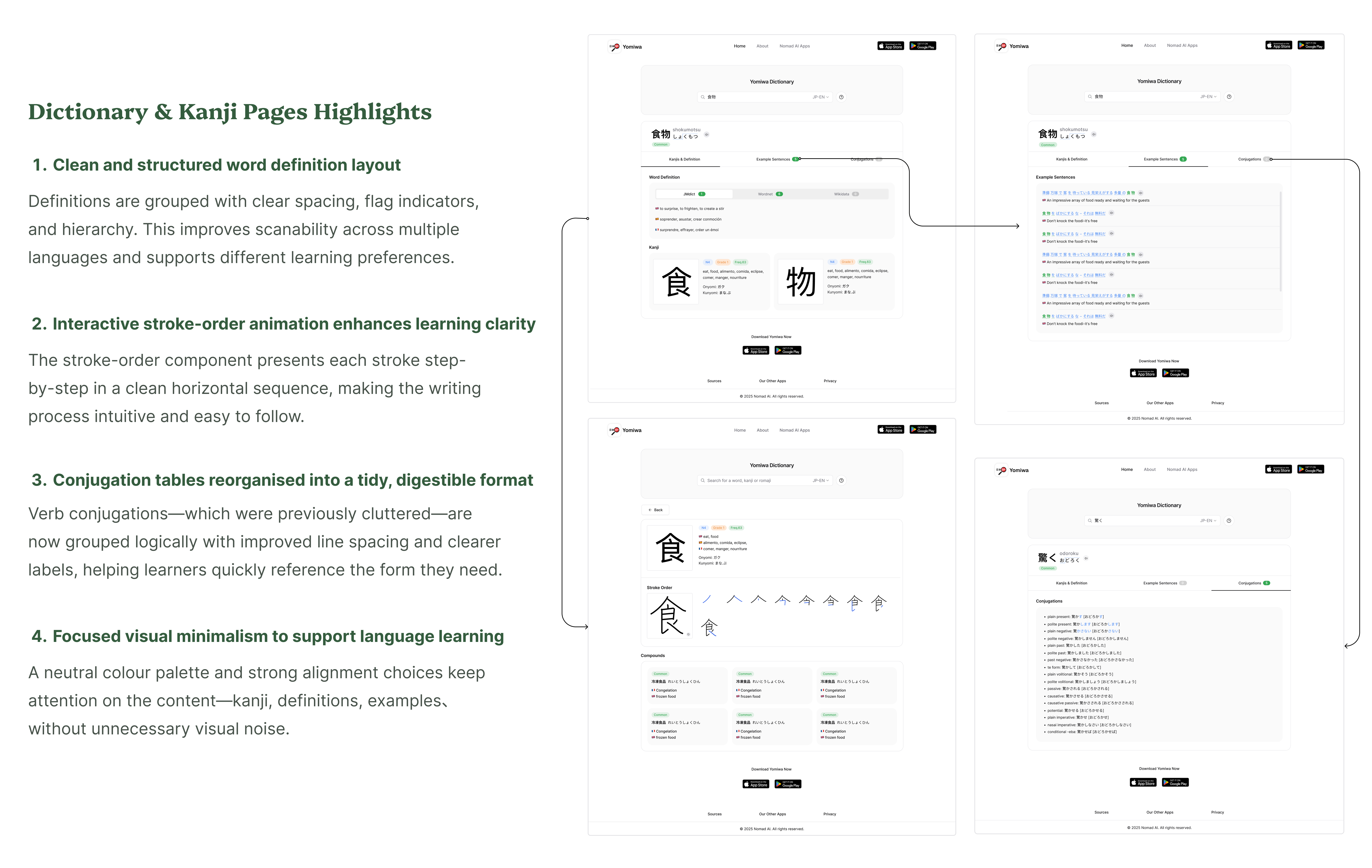
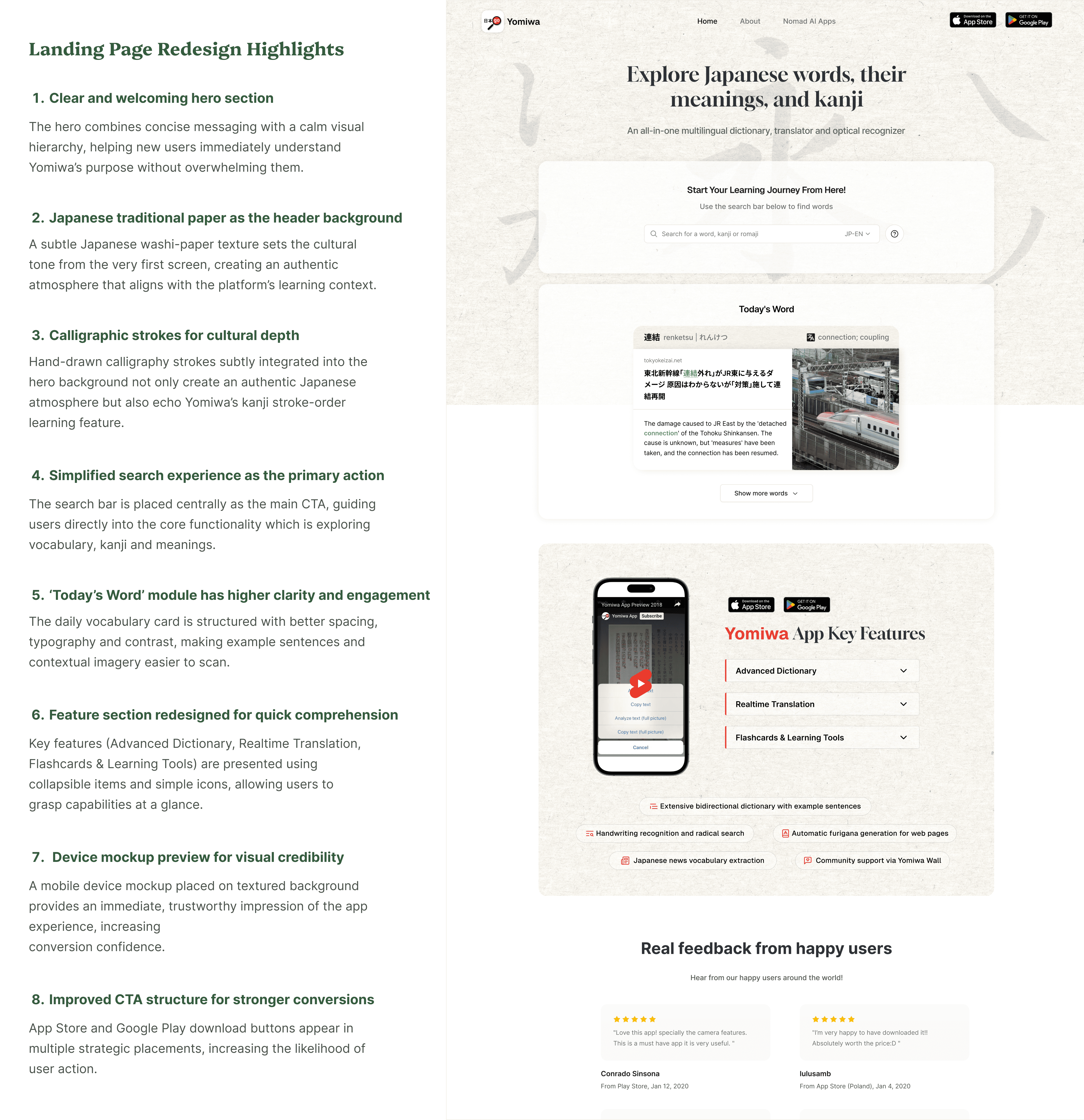
UI/UX REDESIGN · WEBSITE DESIGN
Landing page design & Core pages redesign
Yomiwa is a Japanese language-learning platform seeking a more modern and cohesive user and learning experience. Given the project’s limited budget, I prioritised cost-efficient, high-impact improvements by redesigning a mobile-app landing page and redesigning several key pages to strengthen clarity, information hierarchy, and overall engagement.
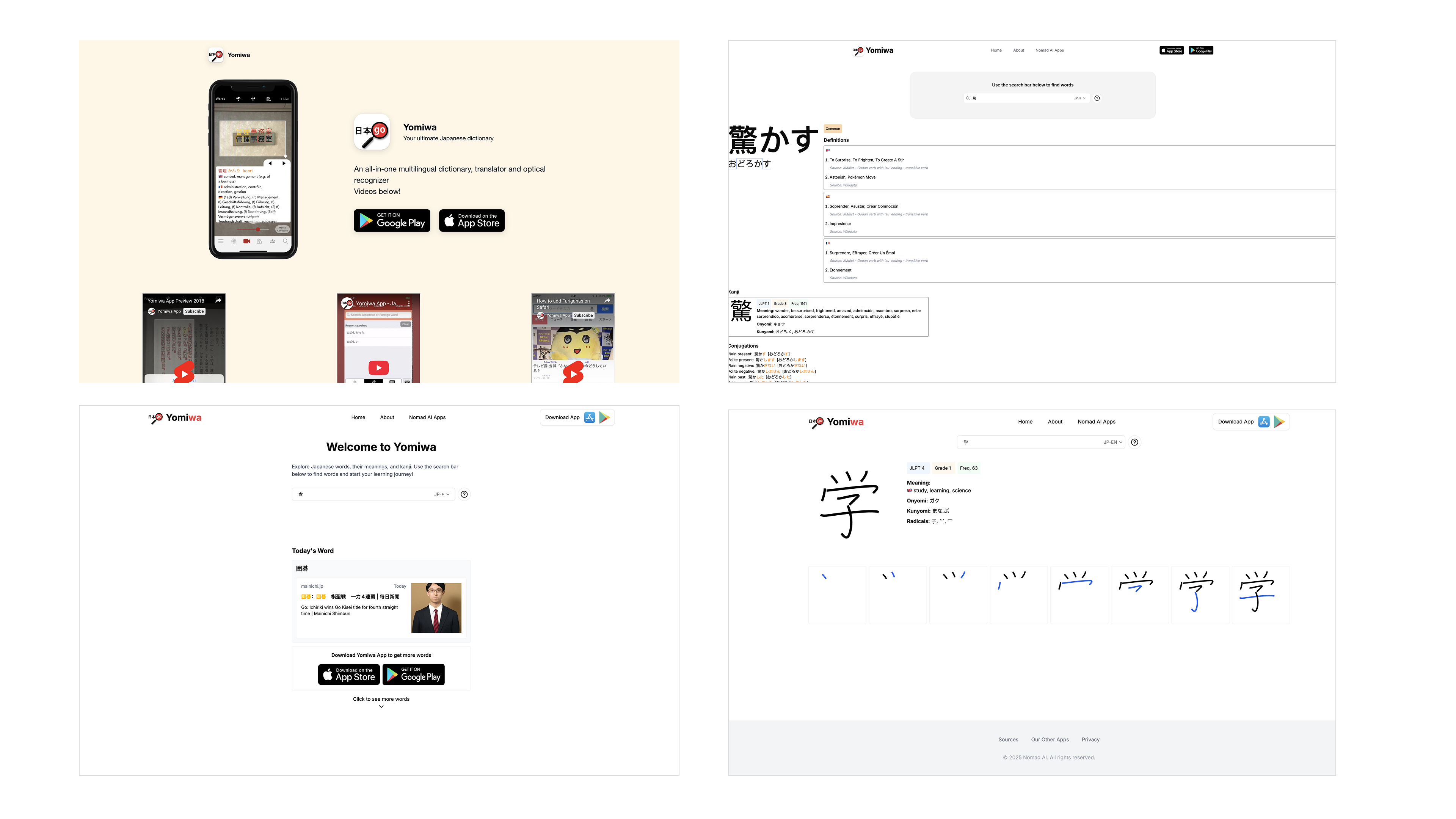
1. The previous landing page lacked a clear visual hierarchy and failed to communicate Yomiwa’s core value proposition, resulting in a weak first impression. Its layout felt unstructured, with scattered content, inconsistent branding, and CTAs that offered little conversion impact.
2. Spacing and layout feel inconsistent
3. Brand personality is missing; no Japanese learning atmosphere
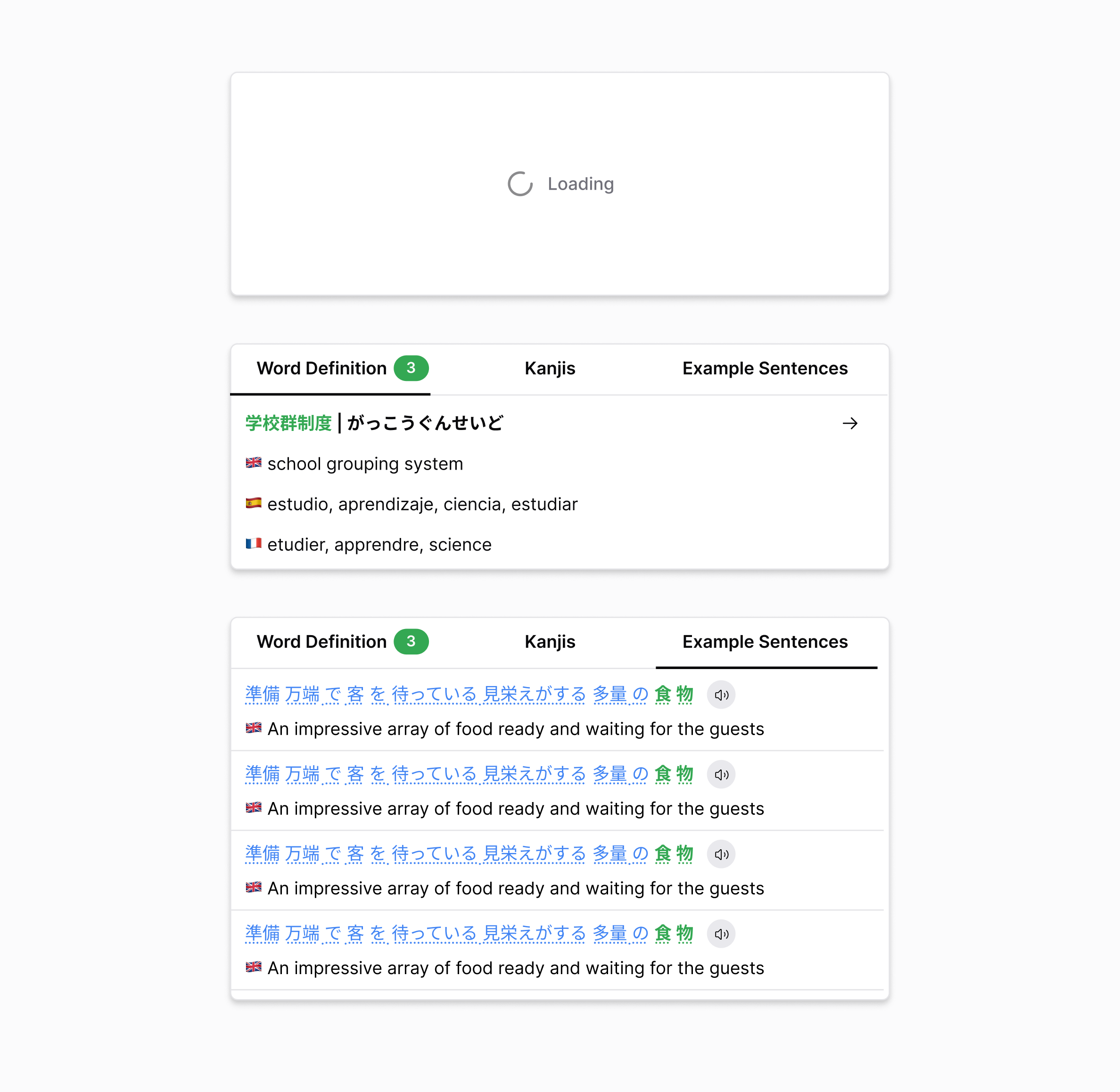
4. Kanji stroke order and dictionary info look disconnected visually
.png)