BRAND VI DESIGN · LOGO DESIGN

Brand Design / Graphic Design
Fintech
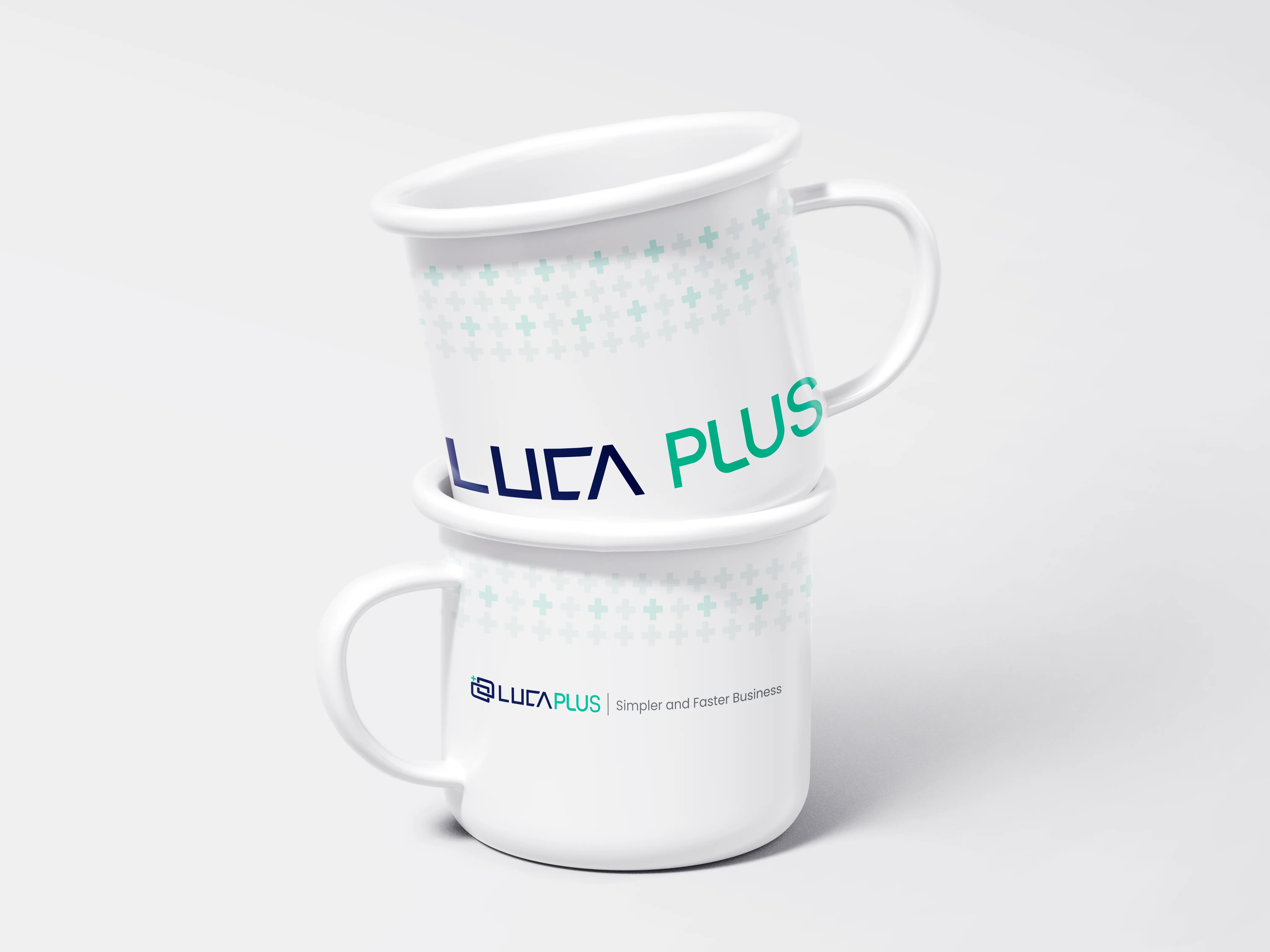
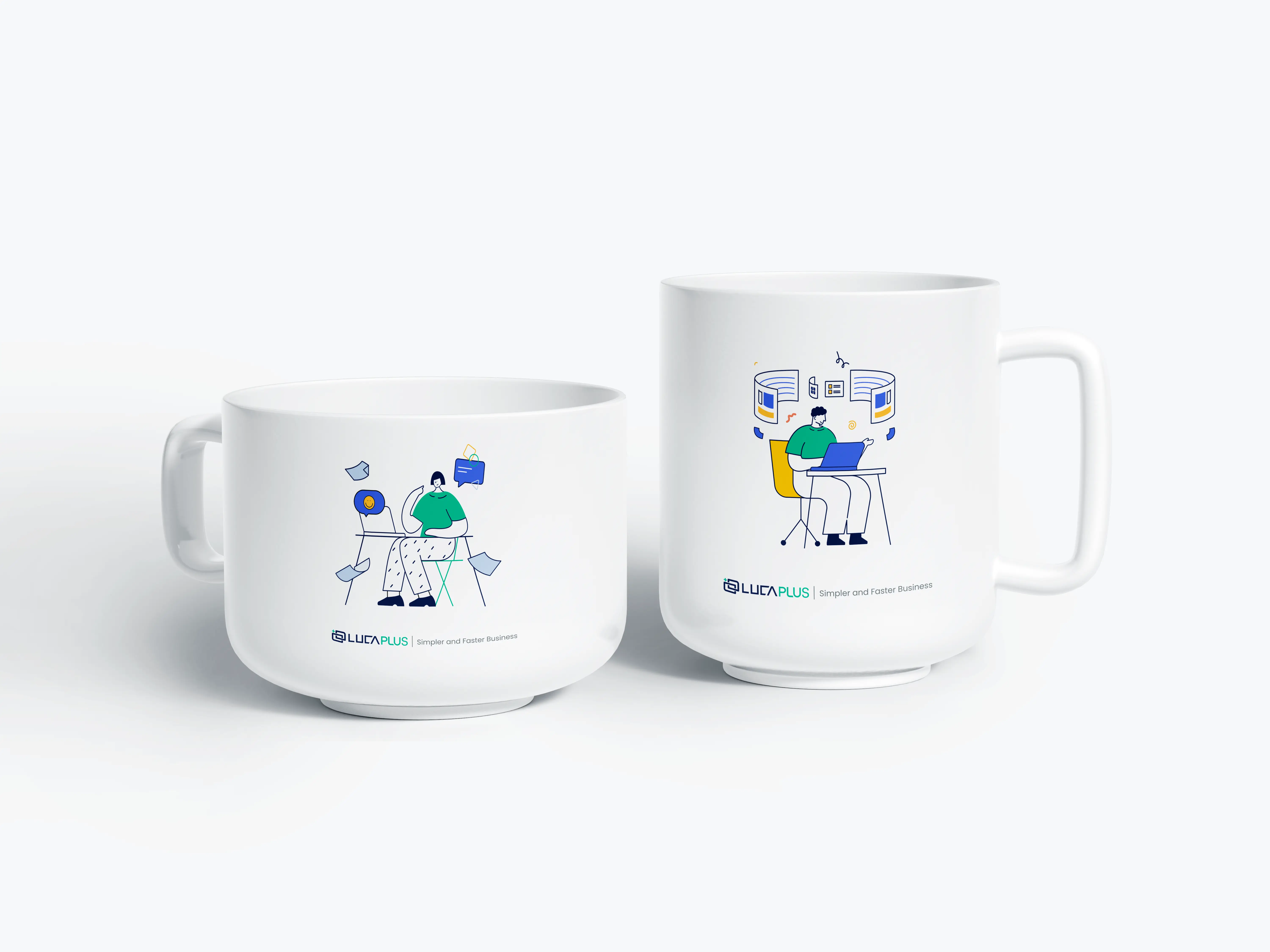
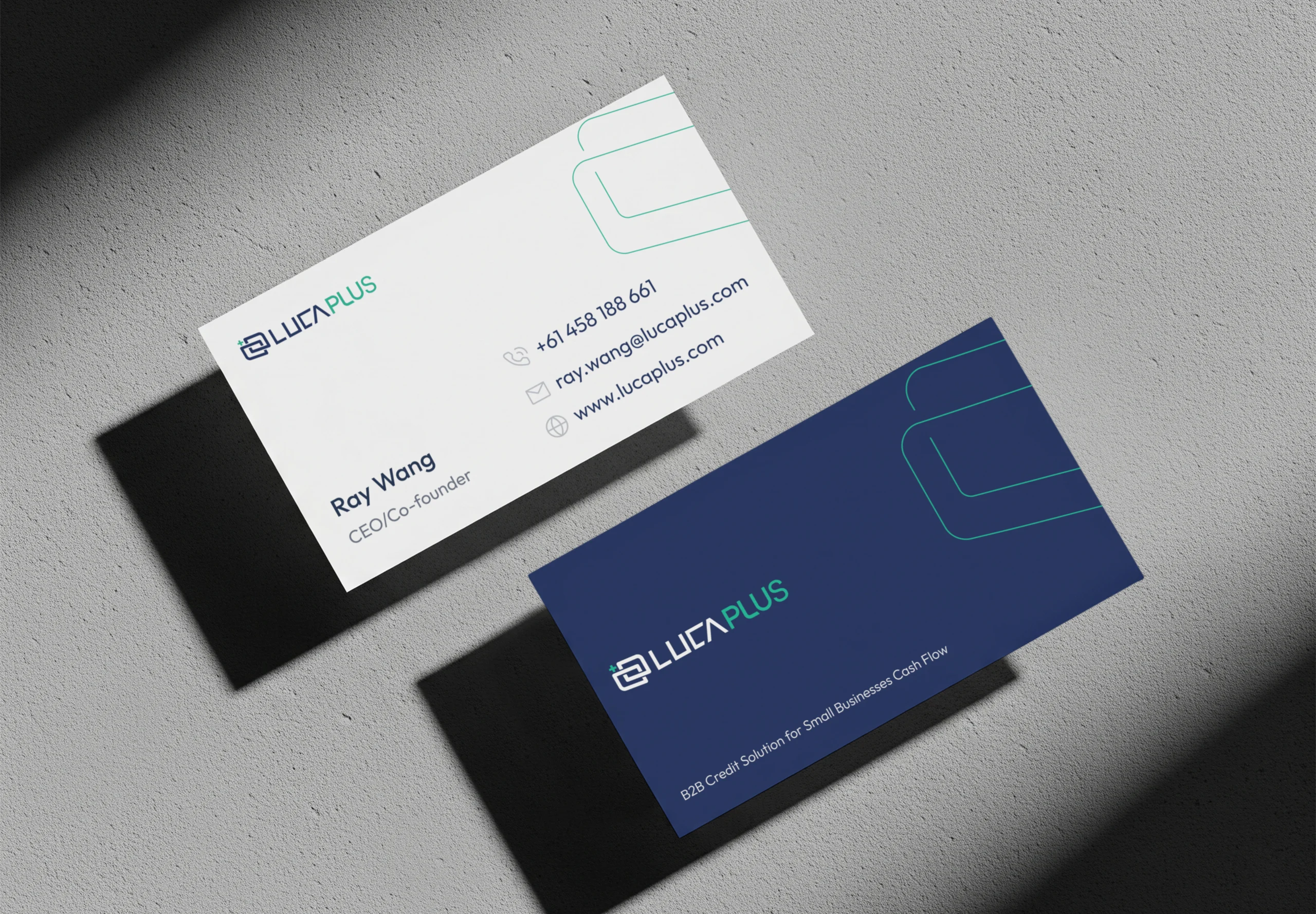
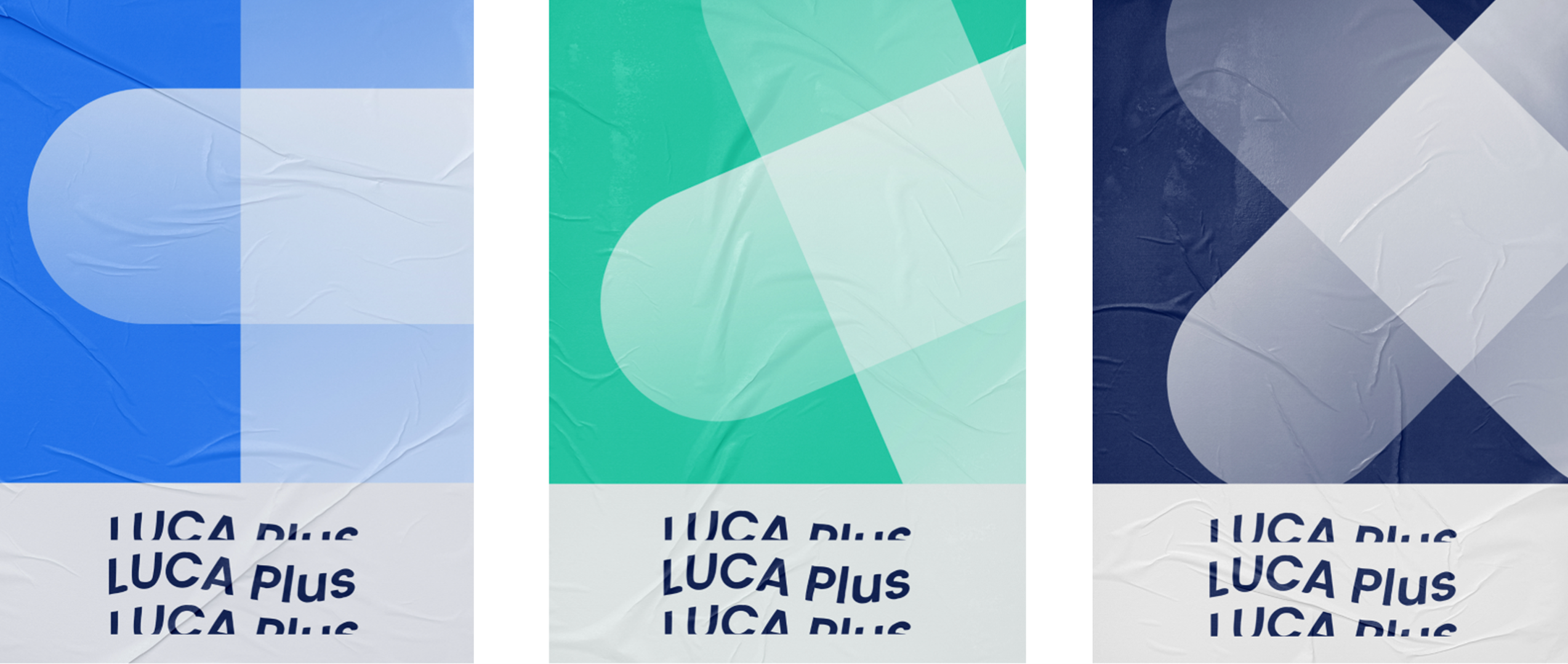
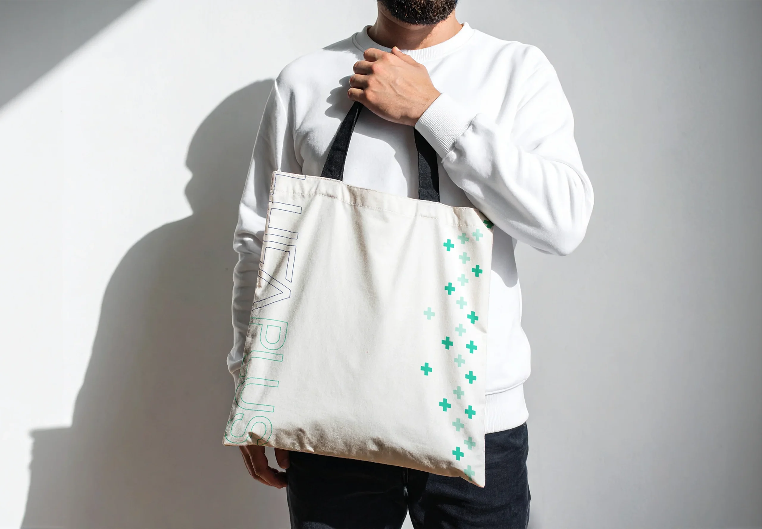
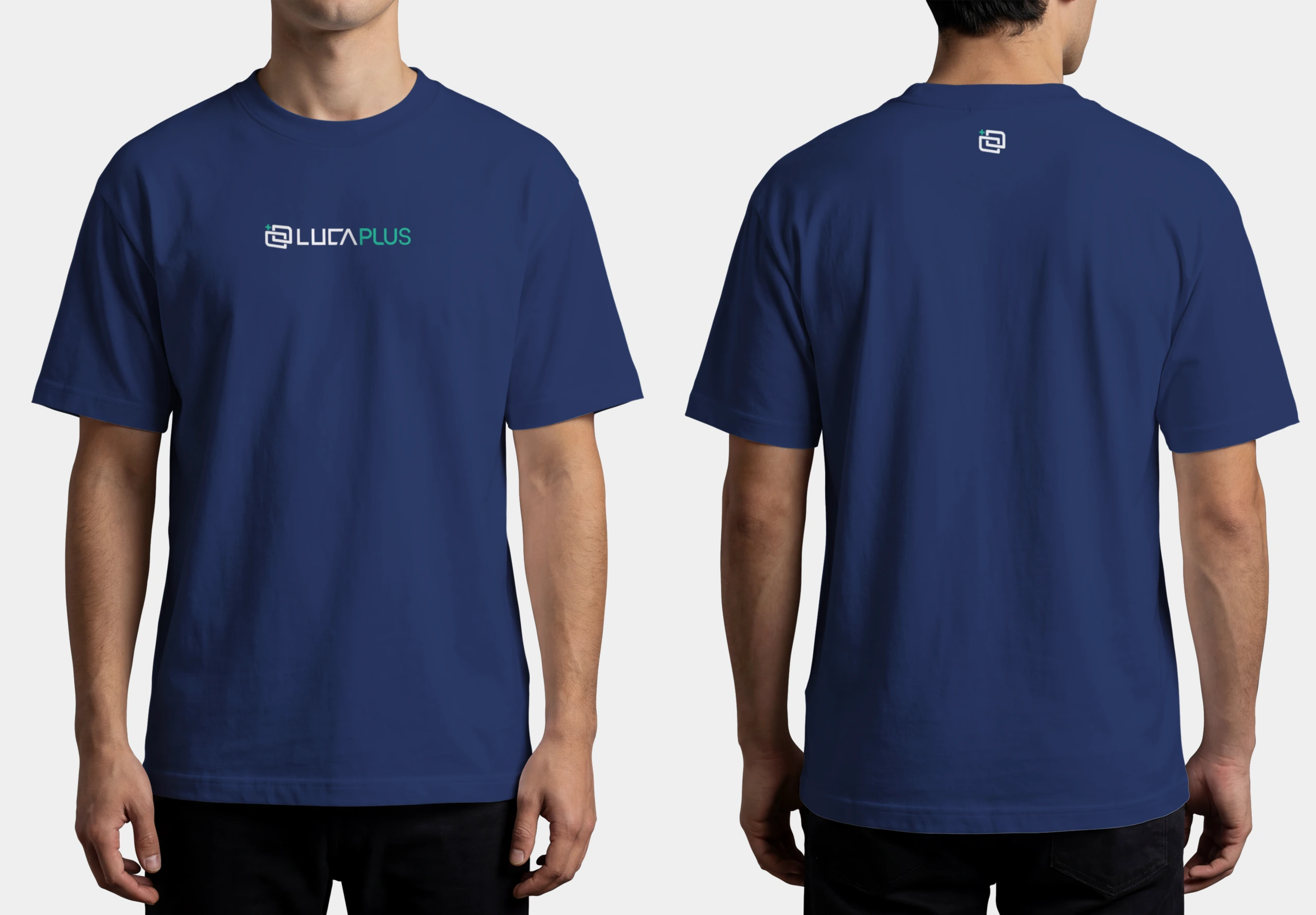
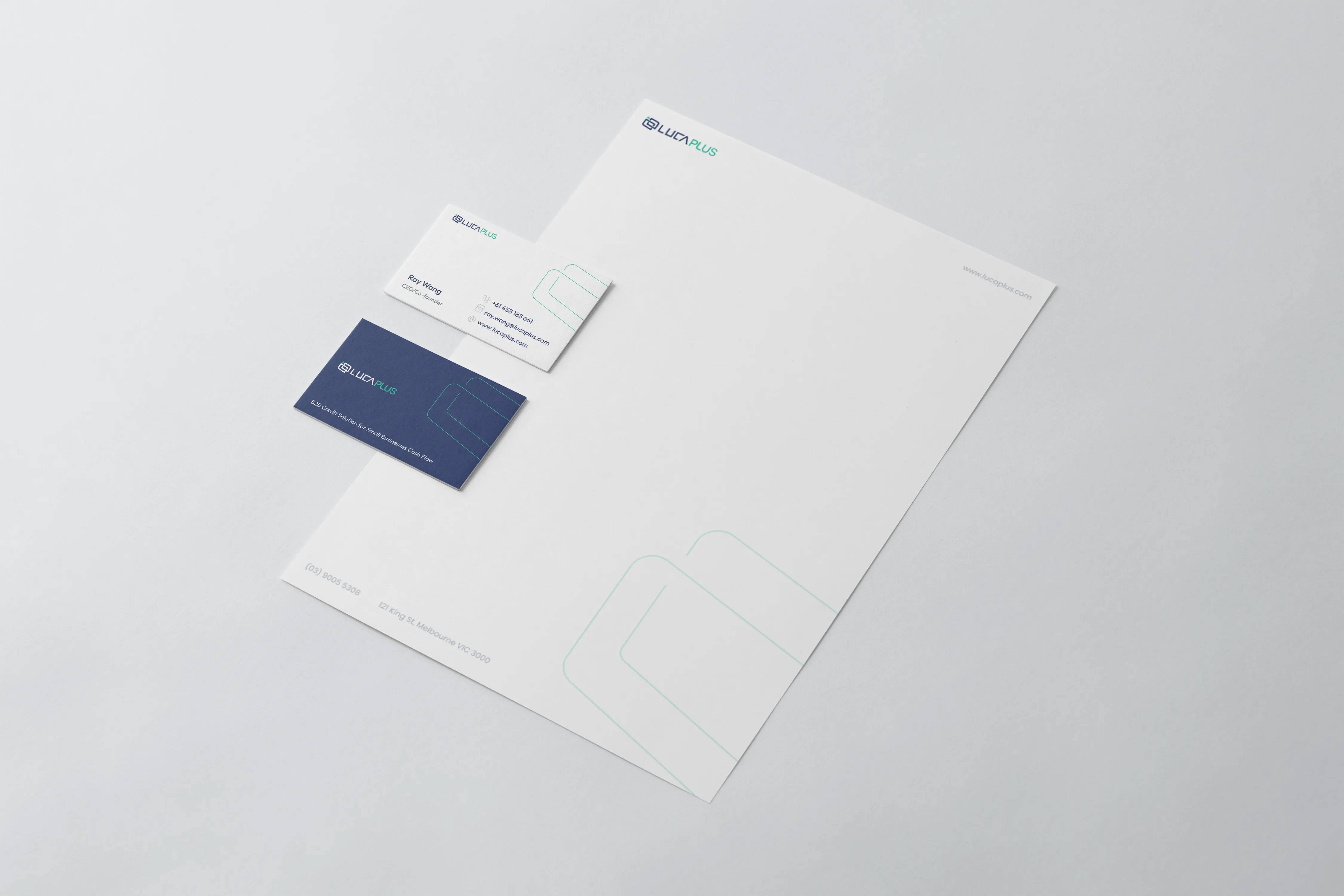
Brand refresh for LUCA Plus, an Australian B2B fintech platform helping small businesses manage cash flow through smart credit solutions. As the company evolved its business direction, the existing logo no longer reflected where the product was heading. This project developed a new logo, and extended pattern that align with LUCA Plus's shifted strategy while retaining the trust and recognition built with existing users.
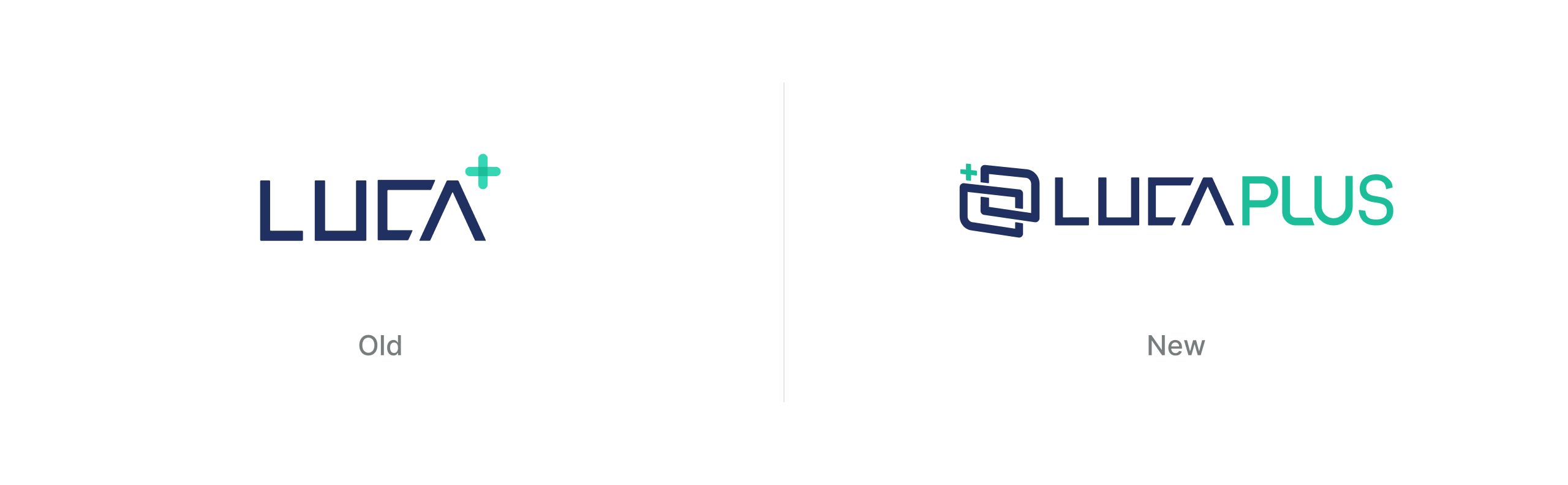

The new logomark is built from two interlocking rounded squares — shaped to resemble credit cards, reflecting the financial nature of the product. Together, they represent the flow of money between businesses and the trust that connects them. Look closer, and you'll also find the letter "L" and a "+" woven into the form, tying the symbol back to the brand name.



.webp)